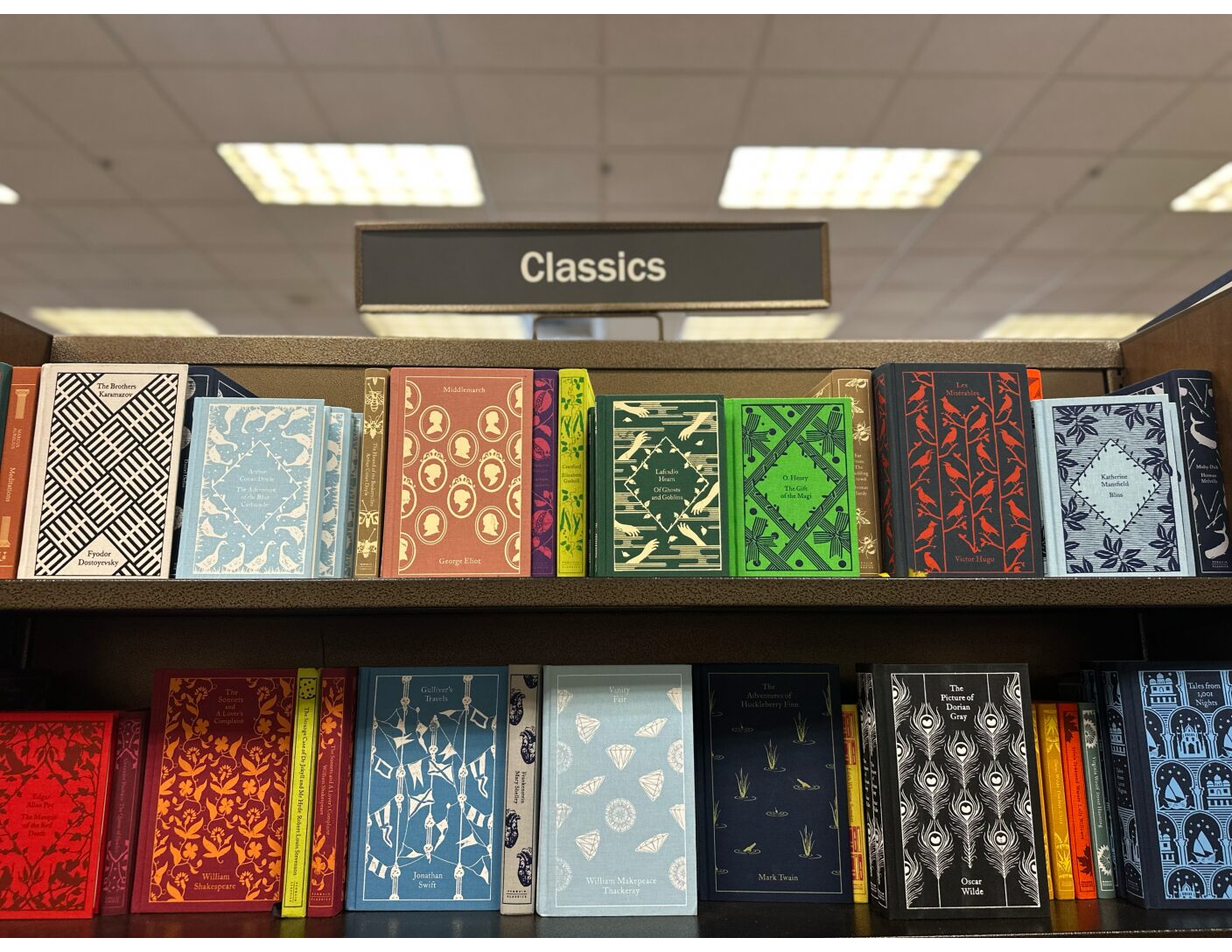
In 2008, the publishing giant Penguin Random House launched their Penguin Clothbound Classics (PCC) series, featuring attractively bound copies of the English literary canon. The books are affordable collectibles with a clear aesthetic formula: linen hardcovers, overlaid with a single-color foil stamp. These covers, designed by Coralie Bickford-Smith, have a rectangular border, the work’s title at the top of the page and the author at the bottom, and a repeating motif in the middle that echoes the book’s content. For instance, The Canterbury Tales has men on horseback, while Moby Dick has whales. As of 2026, PRH has published well over a hundred of these titles, alongside spinoff series with a similar design, such as the Penguin Pocket Hardbacks and the Little Clothbound Classics.
The PCCs are an affordable alternative to fine press editions, for those interested in collecting but without a massive budget. Fine presses, beginning with William Morris’s Kelmscott Press in the late 19th century and continued today by publishers like San Francisco’s Arion Press, typically use quality hand binding and letterpress printing to produce gorgeous, archival-quality books. These books are outside the average middle-class budget, which is where the PCCs seem to fill a market niche: the PCC edition of Mary Shelley’s Frankenstein sells for $25, while Arion’s 2019 Fine Press Edition of the same text went for $1,200. Despite this price divergence, the visual language of Bickford-Smith’s designs—the primary selling point of the PCCs for many collectors online—is inspired by the early fine press. Responding to our inquiry about her influences in March 2026, Bickford-Smith wrote:
Victorian book design was definitely an important influence, particularly the richness of pattern and ornament that was common in that period. William Morris and the Arts and Crafts movement are certainly part of that wider visual language—their emphasis on pattern, craftsmanship, and the integration of decoration with the structure of the book.
Curiously, both the visual language of this movement, as well as the “craftsmanship” and “structure” that Bickford-Smith mentions, have been taken up by a combination of professional and hobbyist bookbinders online such as @thatsmybookshelf and @foryourthoughtsbindery. These creators, or “fanbinders,” adopt PCC designs for their favorite fictional works, often binding titles that lack the cultural cachet of a Penguin Classic. The Harry Potter series, as well as popular Romantasy and fanfiction, are common choices. Binders post videos of their process, which involves stripping a perfect bound paperback and rebinding it in a flat-case binding that resembles Penguin’s branding. This act both demystifies the process of producing a classic edition and reframes the definition of classic itself. A title such as A Court of Thorns and Roses (ACOTAR), for instance, does not merit the label of classic by either Penguin Random House or the literary establishment. It may, however, be a beloved text, more frequently trafficked by some readers than Heart of Darkness or Robinson Crusoe. Fanbinding thus becomes a curious renegotiation of cultural capital, one that centers process and functionality over the mere image of a beautiful book and that registers discontent with conglomerate book culture.

: :
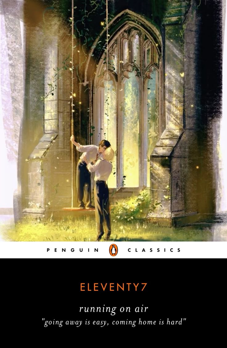
Penguin’s aesthetic legacy has long been instrumental in shaping book buyers’ conception of the classics. “Everybody thinks they know what a Penguin looks like,” Phil Baines declares in his study of Penguin’s design choices, which stops just short of the introductions of the PCCs.1 Penguin’s simple but iconic visual styles grew out of the company’s original business model from the 1930s: “publishing cheap, good-looking reprints of fiction and non-fiction in paperback.”2 Their financial success proved that well-designed paperbacks could make the English canon accessible. The iconicity of the Penguin Classic is demonstrated by its appropriation in fanfiction, with fans marking a fic as a “classic” by creating a black spine Penguin Classics cover (Figure 2).
While Penguin historically asserted the prestige of the classics through the mass dissemination of inexpensive paperbacks, the American publisher Random House manufactured prestige by collaborating with the San Francisco-based Grabhorn Press to produce a number of fine press editions of the classics, such as Whitman’s Leaves of Grass and Hawthorne’s The Scarlet Letter.3 In contrast with Penguin’s reification of the classic by way of cheaply available reading material, the Random House and Grabhorn collaborations manufactured prestige by turning books into “monuments” to authors. As Robert Grabhorn, co-founder of the press, declared, “Of course you’re not going to read [the Grabhorn edition of] Leaves of Grass. You can buy a pocket book. But if Whitman’s your favorite author, you like a monument to him.”4
The PCC series, which began about four years prior to the Penguin-Random House merger, negotiates cultural prestige by combining the accessibility of the Penguin paperbacks with the “monument” status of fine press editions. The PCCs attempt the aesthetics of a fine press book at a middle-class price point. In aiming for the best of both worlds, however, they fall short on two counts: functionality and durability. Typically case-bound with glued spines, rather than sewn, the PCCs are stiff and difficult to open, resisting readership. You might also notice with a well-loved Penguin paperback that perfect-bound books are susceptible to cracks, as the glue breaks under the repeated strain of turning pages. Another durability issue is the tendency of the cover designs—the books’ major selling point—to wear off over time. Many commenters on an interview of Bickford-Smith, published on YouTube by Penguin Random House, have noted these problems:
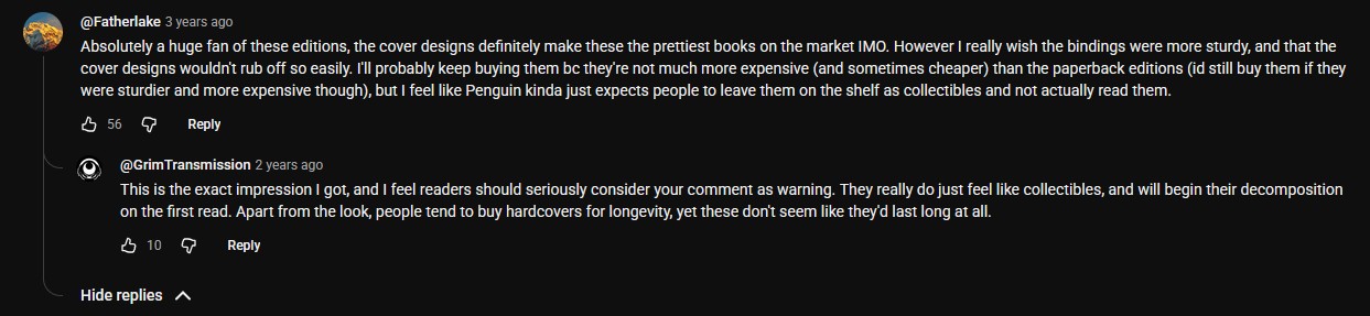
These comments are indicative of how everyday book readers care and think deeply about a book’s materiality. @GrimTransmission’s awareness that “people tend to buy hardcovers for longevity” indicates that people are interested in archival quality work, even if the concept of perfect binding may be unfamiliar to them. In @Fatherlake’s original comment, concern for an ability to “actually read” the books contrasts with Grabhorn’s celebration of fine press literature as historical monuments rather than readable commodities. As Marian H puts it in the title of an apt YouTube video, “These Books Weren’t Made For Reading.” She places the PCC within a broader movement toward the “prettification” of the classics, citing a new “Classics” section at her local Barnes and Noble filled with the PCCs and other beautiful but ergonomically poor editions of the literary canon.
: :
Might Bickford-Smith’s Victorian inspiration William Morris, leader of the Arts and Crafts Movement and founder of the Kelmscott Press, provide the foundation for an alternative approach to beautiful books? The output of the Kelmscott Press was nothing less than spectacular, as Morris worked to bring the beauties of illuminated manuscript culture to the fin de siècle book trade. Yet for Morris, “beautiful” books were never about mere decorative excess. If there is an elitism in Morris’s infamous call to “have nothing in your house that you do not know to be useful, or believe to be beautiful,” it is tempered by the fact that Morris both rejected “art for a few” and thought that beautiful, useful things were indicative of and generative to humane labor processes.5 His philosophy of art was a socialist response to the ever-industrializing state of production at the turn of the century, which rationalized the worker’s soul just as much as it rationalized commodity manufacturing. In opposition to the speed of industrial labor, Morris declared in Art and Socialism (1884), “It is right and necessary that all men should have work to do which shall be worth doing, and be of itself pleasant to do, and which should be done under such conditions as would make it neither over-wearisome nor over-anxious.”
Morris found such work in the meticulous intricacies of printing and binding texts, because beautiful books could only be produced under pleasurable labor conditions. Fidelity to Morris and the book culture he advocated for demands attention to the process and materiality of book production. Fortunately we can do that, thanks to an episode of the British television series Inside the Factory, where hosts Paddy McGuinness and Cherry Healey take viewers inside Clays’ book manufacturing factory in Suffolk to glimpse the production process for the PCC edition of Jane Austen’s Pride and Prejudice.6 We cannot claim to speak to the interiority of the factory workers, but we can glimpse the speed and sound under which they work. “Gloria in excelsis Deo” scores the scene where the viewer is introduced to a colossal Manroland AG web offset press, capable of printing one copy of the book every half second. McGuinness wears protective earmuffs at this stage of the process, and we spot similar PPE as end papers and cases are glued together on a mechanized assembly line, with the occasional human-in-the-loop loading paper, pressing buttons, and observing the machines at work. At Clays, bookmaking is rationalized, accelerated, and divided according to the rhythms of these machines.
The designer, Bickford-Smith, is not to blame for this rationalization, and the fanbinding community inspired by her designs provides a vastly different experience of bookmaking labor than the Clays factory. A search for “Clothbound Classic” on TikTok and similar platforms reveals bountiful spinoffs of Bickford-Smith’s design. Shortcutting all required expertise, community members have used free online tools to generate their own Clothbound or Penguin Classics layouts with the click of a few buttons. For $75, Jess Leach, who runs JesterCat Binding Co., will manufacture a custom PCC version of any book of your choosing. Of most interest to us, content creators such as That’s My Bookshelf have created lengthy tutorials for people interested in learning how to rebind their favorite books into a PCC object.
It is tempting to view fanbinders as merely participating in a conservative fetishism of the book, and there is an undeniable irony to the use of the PCC aesthetic for what many would deem low-cultural reading. After all, it is the (novel-centric) logic of the book as an object of prestige, individual genius, and private property that constructs fanfiction as amateurish. Among the litany of qualities for which fanfiction is castigated are copyright violations, short cutting authoritative publication networks, and intense authorial-community relations: in short, threats to everything “book culture”—as upheld by the conglomerate PRH—constructs as prestigious. In the case of ACOTAR, adopting the PCC aesthetic works to grant cultural status to books which scholars would hesitate to call a classic. As these fanbinders’ genuine love for the PCC aesthetic makes clear, they are not trying to be critical of the design. We are instead left with a generative antinomy: the PCC aesthetic validates a particular “low-cultural” book, and the PCC aesthetic is partially responsible for the need to validate books in the first place.
We can move beyond these contradictory outcomes only when we move beyond what has been called “book culture” as a purely visual phenomenon. For example, we can compare how both the PCCs and fanbinders attach their cover designs to demonstrate how material and process affect accessibility, functionality, and durability. The PCCs attach their cover designs using a process called foil stamping, in which a metallic or colorful foil sheet is laid atop the cloth cover and pressed onto the book using a hot metal stamp. The foil stamping process was perfected during the Victorian era of book culture, creating gilded book covers. However, it was originally used on leather covers, where the natural indentation or depression would have protected the foil from flaking away. Perhaps because foil stamping has a high start-up cost, fanbinders often print a design onto heat-transfer vinyl (HTV) instead, then heat-press it onto the cloth, commonly with a household iron. HTV is a polymer that is unlikely to flake in the same manner as the PCC’s foil stamp. This does not mean fanbinding creates objects of perfect durability—HTV might peel, rather than flake—but the switch to HTV is materially honest. Fanbinders work organically and creatively with new materials, intuitively problem solving both the durability and start-up cost issues of PCCs.
The fanbinder’s laborious reconstruction of genre fiction in the aesthetic trappings of a classic is also an archival impulse. In the case of fanfiction, remediating born-digital works into a physical book is a necessary archival act, as fics are consistently subject to editing and takedowns without any notice. For example, @v.f.h_crafts’ PCC-inspired rendition of the popular AO3 fanfiction All the Young Dudes, a retelling of Harry Potter’s father’s time at Hogwarts, arguably improves the lifespan of this born-digital object. Of course, fanbound book-objects in themselves are not stellar archival formats: books require specific materials to solidify their archival qualities such as acid-free paper, sewn bindings, and casebound covers. But even though fanbindings may be imperfectly constructed, they are a testament to the capacity of fans to remediate the culture that they love into beautiful, physical objects. Fan binders possess a competence in what Abigail de Kosnik would refer to as an archival repertoire, a repetitive bodily action required to upkeep archives and repair archival objects like the codex.7 If PRH is going to publish their books in flimsy formats, or if they are going to issue takedown requests for copyrighted works, then we can trust these fans to ensure their continued availability—and to repair their own books when they inevitably fall apart.
These bookmaking practices are also shared with a broader community, taught in videos which show the complete fanbinding process and depict joyful bookmaking labor akin to Morris’ call for dignified, pleasant work. Where the Penguin editions are mass-produced in rumbling factories, these fan editions are produced in the slow, quiet intimacies of the home studio. Indeed, watching a That’s My Bookshelf video is instructive bookmaking ASMR. A video posted in September of 2024 shows her rebinding ACOTAR with a PCC-inspired cover. TMB walks through each stage of the process—ripping off the original paperback cover, folding endsheets, gluing the spine, creating the rose-decor covers, and casing in the book. Viewers are lulled by this methodical process and invited to join in on the fun. Speaking to the listener about a possible error, TMB calmly explains, “that’s okay because you’re going to cover it with your HTV and so you won’t really be able to see when it’s done—I mean you will, but it’s fine, it’s your own book.” TMB inhabits and teaches bookbinding as an opportunity to take pleasure in the individual labor process. Although the videos themselves are peppered with Amazon affiliate links and shrunk down into bite-sized reels for consumption on TikTok, they offer us glimpses of independent bookmaking as a practical, everyday craft—a slow and thoughtful antidote to conglomerate book culture.
This contingent site of laborious pleasure is where Bickford-Smith’s design lives up to its association with the Arts and Crafts Movement. If we move beyond the impulse to characterize fanbinding as thoughtless kitsch, we gain an understanding of how materiality and process are central to the importance of the book as an object. Far from a blind consumptive hivemind, critical fandoms voice dissatisfactions with industrial book production and remedy them through practice: rewriting and rebinding insufficiencies and bequeathing solutions to the public for free. We should all feel so flattered to have our spines ripped by their hands.
: :
Endnotes
- Phil Baines, Penguin by Design: A Cover Story 1935-2005 (Penguin Books, 2005), 6.
- Baines, Penguin by Design, 12.
- Megan Benton, Beauty and the Book: Fine Editions and Cultural Distinction in America (Yale University Press, 2000). See Chapter 5, “Classics or Cabbages,” for a discussion of the business relationship between PRH and Grabhorn Press.
- Robert Grabhorn, “Robert Grabhorn: Fine Printing and the Grabhorn Press.” Interview by Ruth Teiser in 1967. Oral History Center, The Bancroft Library, University of California, Berkeley, 1968.
- William Morris, “The Beauty of Life,” William Morris on Art and Socialism, edited by Norman Kelvin (Dover, 1999), 53.
- Inside the Factory, season 9, episode 5, “Hardback Books,” directed by Michael Rees, aired on January 28, 2025, on BBC Two.
- Abigail de Kosnik, Rogue Archives: Digital Cultural Memory and Media Fandom (MIT Press, 2016).
Caroline Bailey and Luca Messarra